
The Congo Tree
Redesigning and developing a new website for a non-profit based in the UK and Democratic Republic of Congo (DRC)
2025 Update
Check out The Congo Tree’s new website! https://thecongotree.org/
This post runs through the initial stages of redesigning the charity’s new website before handing over the final delivery to Milk Bottle Designs
Project Overview
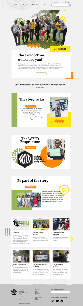
The Congo Tree is a youth development charity based in the Democratic Republic of Congo (DRC) and the UK. They equip young people in DRC with transferable life and leadership skills, support them with mentoring and encourage them to get involved in their community.
Their main goal was to have a fresher look and improved functionality, particularly with the addition of a drop down menu and a toggle button to swap between the English and French language. I worked in a team with two other UX designers to deliver an initial design.
Identifying the problem
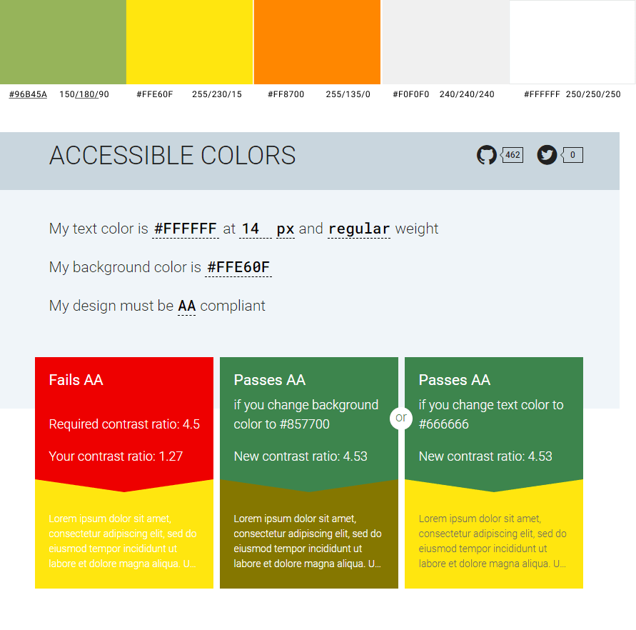
We used user research to learn more about pain points users faced when using TCT’s existing website. During user testing, we discovered that users were confused about the information they were seeing on the website, and unable to use it on a mobile device. We also learned that several colour combinations and typography choices on the website made information difficult to read.
Therefore, we planned to improve information architecture, navigation, accessibility and create a responsive web design (RWD) solution. Our redesign of the Congo Tree website aimed to achieve greater user engagement and allow the non-profit to share its values and goals with more users.
Design approach and prototyping
Our priorities during our design was to honour the organisation’s identity and values. We found inspiration from other non-profit websites and worked closely with The Congo Tree to make sure we had a full understanding of their character and vision. We opted for fun, vibrant and youthful shapes, colours and fonts, and made sure all our components were responsive and interactive without being distracting.

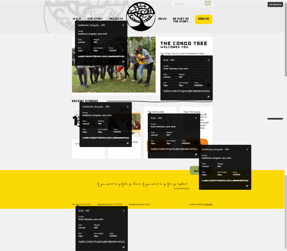
We analysed and tested TCT’s existing website, including digital accessibility and colours, to gain a deeper understanding of specific pain points users were having. We tested the functionality and style of each iteration with users and eventually established a style guide for both the desktop and mobile websites.
During our design iteration process, we kept revisiting the main goals of the website, asking ourselves “what is the ‘happy path’ for users to take”, and “what was the main purpose for the website to serve for the charity”.
We iterated our designs according to the feedback we received: the footer background colour was too bright, the cards on the homepage didn’t look clickable and there needed to be a clearer call to action (CTA) on the landing page. We also edited some copy to make the navigation bar clearer and cleaner.
During a conversation with the TCT team, we learned that the original phrases in the navigation bar were core messages in inviting people to ‘be part of the story’. As a result, we chose to re-inject this brand identity by introducing new sections to the landing page. These sections drew more attention to those all-important core messages, and also created more opportunities for the user to act as they learned more about the organisation.

The solution
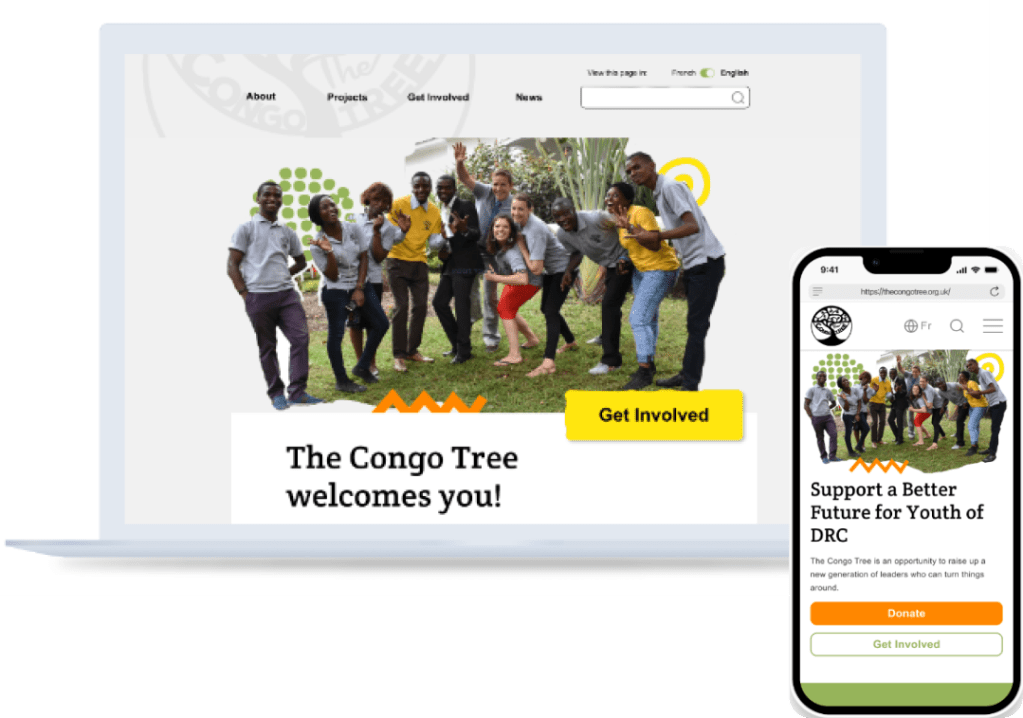
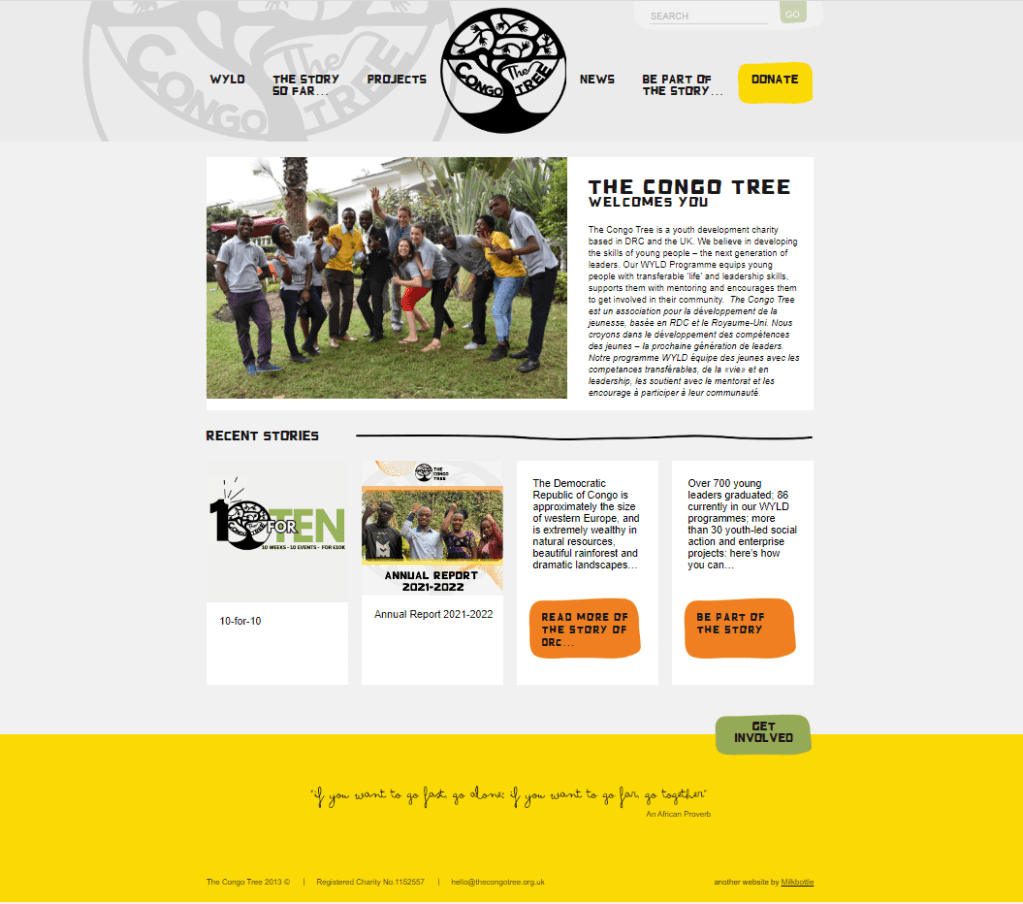
Our finished design included the dropdown menu, a language toggle feature, clearer information and more readable content. For mobile, we designed the main CTA to be to donate. For the desktop, the design’s main CTA was to find out more ways to ‘Get Involved’ with the organisation.
The images below show some screenshots from before and after the redesign.

Next steps
The Congo Tree absolutely loved our design! They told us it was exactly what they imagined, and that seeing it on a page means they now have a structure to help them as they update their content. We discussed more additional features they might want (like a pop-up encouraging signups to a newsletter) and agreed to meet again in a few weeks.
Our next meeting was even more exciting than the first! The team had worked on a new colour and graphics palette, picked new photos to include on their website and updated and written new content. We discussed the requirements of site hosting and decided to create a new template in WordPress to give the team a bespoke but easy CMS to work with.
